Step into the world of…
Chavie Cohen Copy
Project Overview
Chavie Cohen, a new copywriter, approached us with a vision to create a brand that would help her stand out in the competitive world of copywriting. As a small business owner passionate about creating compelling copy for small to mid-sized businesses and non-profit organizations, Chavie needed a brand identity that would reflect her professionalism, friendliness, and approachability while also showcasing her unique voice in the industry.
Strategy Development
Through our discovery process, we defined Chavie Cohen Copy's brand attributes as:
Professional
Friendly
Approachable
Sleek
For the color palette, we chose:
Turkish Rose and Cloud Burst as the main colors, conveying warmth and professionalism
Pale Rose, Eggplant, and Bizarre as additional colors for variety and contrast
The typography selection reflected the brand's professional yet approachable nature:
Solway (light, regular, and bold) for headings
Varela Round for body copy
The Solution
The final brand identity for Chavie Cohen Copy emerged as a perfect blend of professionalism and approachability. The logo, with its clever use of nested "C"s and ellipsis, became a unique identifier for Chavie's services. The carefully selected color palette and typography further reinforced the brand's warm yet professional nature.
We provided comprehensive brand guidelines, including logo variations, color usage, typography rules, and application examples for various marketing materials. This ensures consistency across all brand touchpoints, from business cards to website design.
The Challenge
Our task was to create a brand identity that would:
Reflect Chavie's professional yet approachable personality
Stand out in the crowded copywriting market
Avoid clichéd imagery often associated with writing (such as pens or feathers)
Convey Chavie's dedication to effective communication
Work across various platforms and materials
The challenge lay in creating a unique visual representation of Chavie's services without relying on traditional writing symbols, while still maintaining a clear connection to her craft.
Creative Process
The logo design process required creative thinking to meet Chavie's specification of avoiding pen or feather imagery. We explored various ways to represent writing visually, ultimately landing on a concept that incorporated the three 'C's in Chavie Cohen Copy.
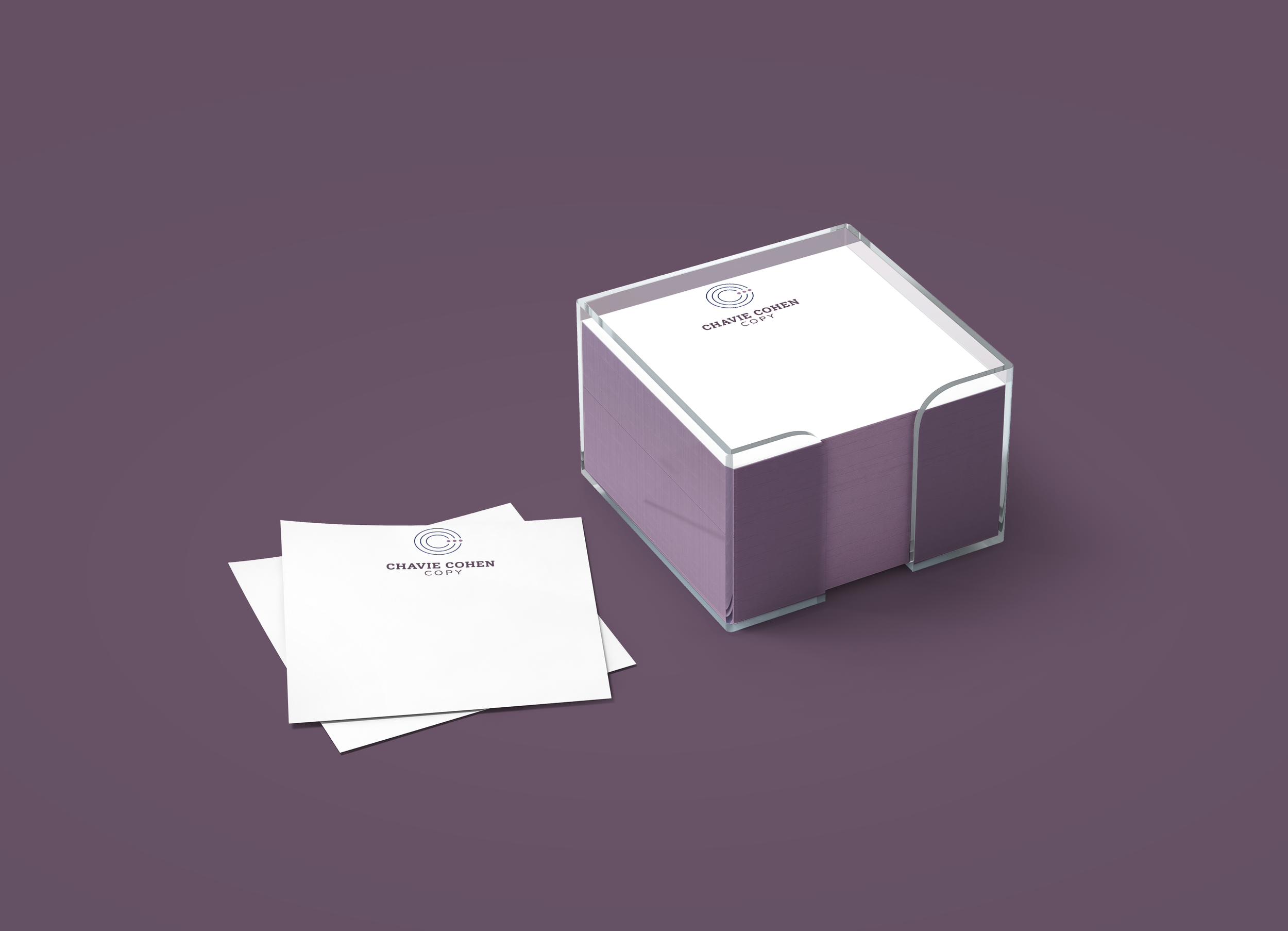
The final logo design featured three nesting "C"s with an ellipsis cutting through them, subtly alluding to Chavie's role as a copywriter without resorting to clichéd imagery. This unique design encapsulated the brand's sleek and professional attributes while maintaining a friendly and approachable feel.
To bring the brand to life, we created a 3D scene portraying a potential office setting for Chavie, helping to visualize her professional environment and adding depth to the brand's visual identity.
Results & Impact
Chavie's reaction to her new brand identity was overwhelmingly positive. She shared:
"Working with Adeena was a real pleasure. She took the time to understand my business in depth and put a lot of thought and creativity in creating a wow-worthy logo and branding package for me. The final product is a real work of beauty and art and I'm excited to have it represent me and my work. If you're looking for an easy and pleasant experience with stunning results, choose Adeena."
The new brand identity successfully positioned Chavie Cohen Copy as a professional, friendly, and approachable copywriting service. The unique logo design and cohesive brand elements have given Chavie a strong foundation to stand out in the copywriting industry, setting her up for success as she grows her business.


