Step into the world of…
Kal Kanesher
Project Overview
Kal Kanesher Kriah, a program dedicated to helping children learn to read Hebrew, approached us for a comprehensive rebranding. Their goal was to create a brand identity that would build trust with parents while also appealing to children with energy and excitement. The project encompassed everything from logo design to course materials, aiming to create a cohesive and engaging brand experience.
Our task was to:
Create a brand identity that balances trustworthiness for parents with appeal for children
Design a logo that captures the essence of learning and progress
Develop a color scheme that is both energetic and professional
Rebrand all existing materials for consistency, including books, flashcards, and activities
Design engaging slides for their courses
Create an ad for their Masterclass that would increase interest and enrollment
The challenge lay in crafting a visual identity that would resonate with both parents and children, while also effectively conveying the program's commitment to Hebrew reading education.
The Challenge
Strategy Development
Through our discovery process, we identified key brand attributes:
Trustworthy
Energetic
Educational
Progressive
Engaging
We chose a color palette that reflected these attributes:
Bright sky blue: representing trust and openness
Bright orange: conveying energy and enthusiasm
Deep navy: adding a touch of professionalism and stability
Creative Process
The logo design process focused on creating a symbol that represented both progress in learning and the program's name. We developed an icon in the form of a double checkmark that cleverly doubles as:
A child taking flight, symbolizing progress and achievement
A bird (nesher in Hebrew), tying into the program's name
For the Masterclass ad, we utilized the new brand elements to create a compelling and eye-catching design that would stand out from their previous advertising efforts.
We then applied the new brand identity across all of Kal Kanesher Kriah's materials:
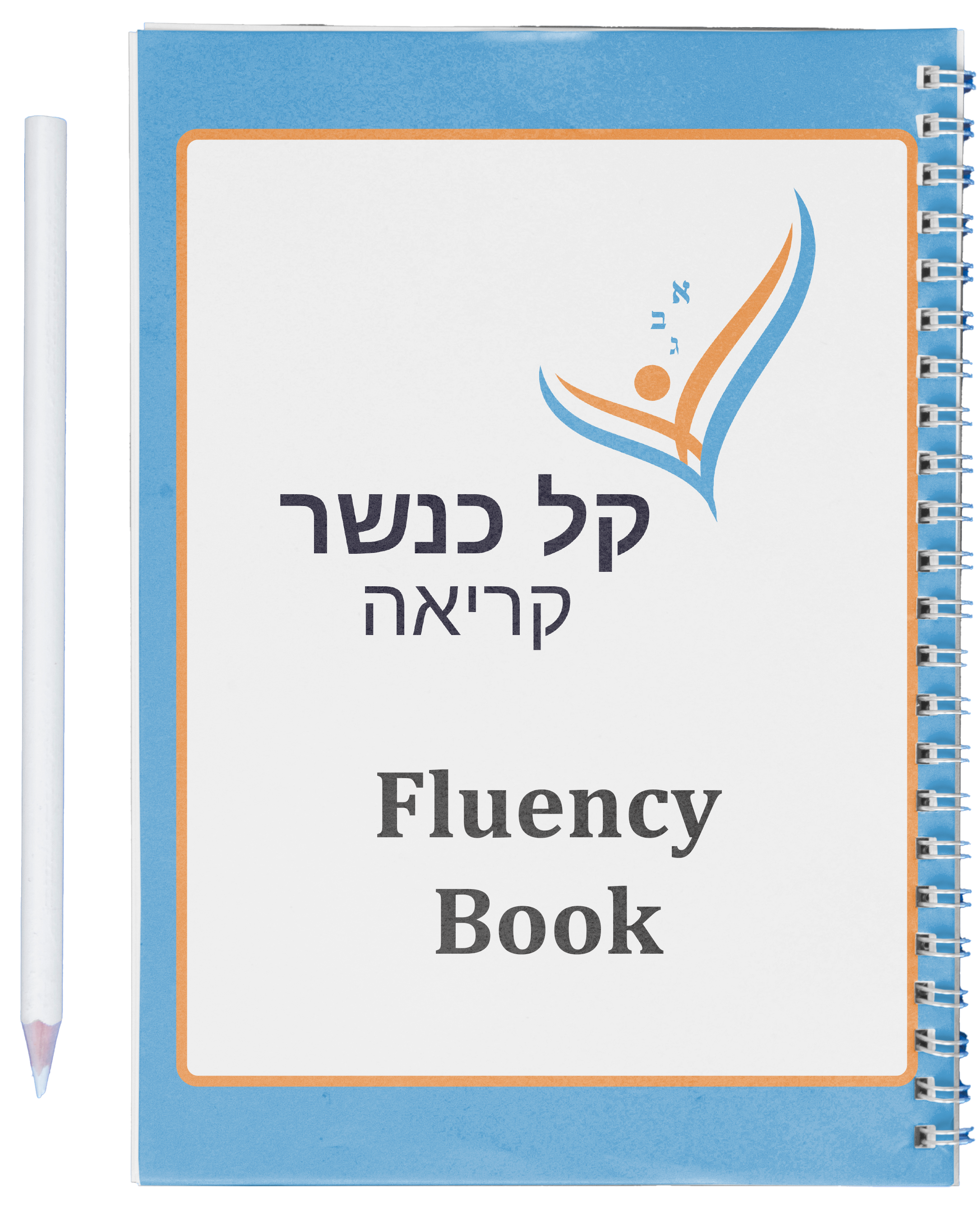
Redesigned books to align with the new brand
Created cohesive designs for flashcards and activities
Developed engaging slide designs for their courses
Throughout the process, we ensured that each element maintained the balance between trustworthiness and child-friendly energy.
The Solution
The final rebranding for Kal Kanesher Kriah resulted in:
A distinctive logo featuring the dual-meaning checkmark/bird icon
A vibrant yet professional color scheme of sky blue, bright orange, and deep navy
Cohesively branded educational materials, from books to flashcards
Engaging course slides that maintain the new brand identity
A standout Masterclass ad that significantly increased interest compared to previous campaigns
Results & Impact
The rebranding of Kal Kanesher Kriah was met with enthusiasm from both the client and their target audience. Key outcomes included:
Increased trust and credibility among parents, thanks to the professional yet approachable new brand identity
Greater engagement from children, drawn in by the energetic colors and playful logo
Improved coherence across all educational materials, enhancing the learning experience
Significantly increased interest in their Masterclass, with the new ad outperforming all previous campaigns
The new brand identity successfully positioned Kal Kanesher Kriah as a trusted, energetic, and effective Hebrew reading program. By balancing professionalism with child-friendly elements, the rebranding has helped the program appeal to both parents and children, potentially expanding their reach and impact in Hebrew education.
The cohesive application of the new brand across all touchpoints - from books to digital slides - has created a strong, recognizable identity for Kal Kanesher Kriah, setting them apart in the field of Hebrew reading education.


